ZELDA TITLE SEQUENCE
I used this project as a way to hone my skills with lighting in After Effects, cameras, as well as creating engaging compositions by combining motion and typography. This piece is inspired by The Legend of Zelda: Breath of the Wild, and is my interpretation of what a title sequence would look like if the video game was adapted into a show or movie. In the game, you can find a tapestry telling the story of the game’s lore, which I used as inspiration for the sequence. I also made custom title cards for the sequence to elevate the piece.
This is a student project that has no affiliation with the brand/show that is depicted. None of my work has been used in an official manner.
CUSTOM TITLE CARDS
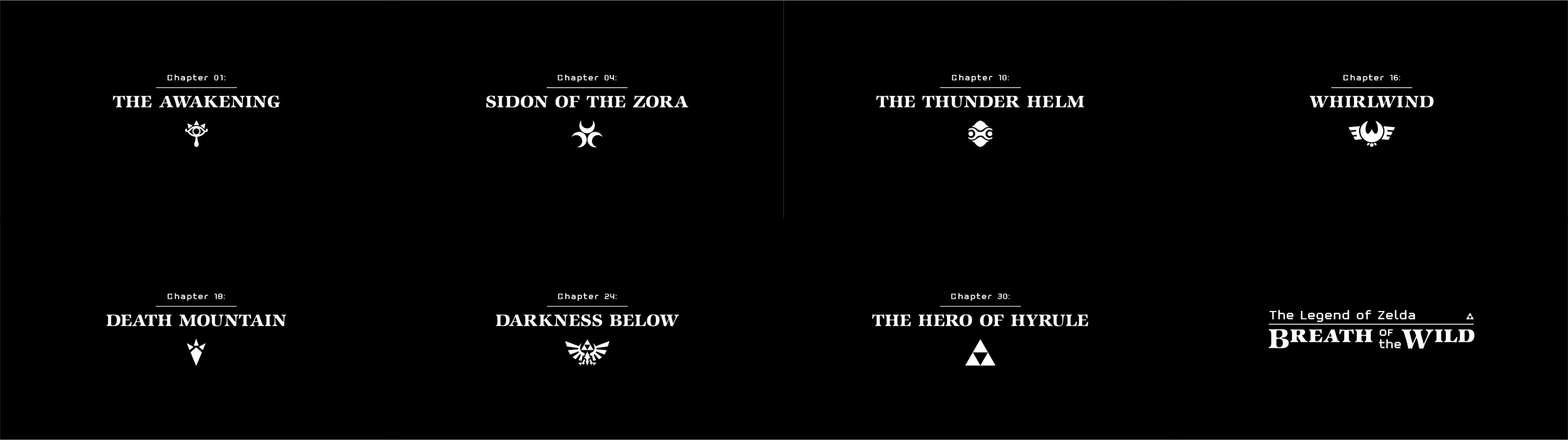
CUSTOM TITLE CARDS
TYPE BREAKDOWN
I used two fonts for the type showcased. For the bold titles I used the same font that was used in the original Legend of Zelda logo back when the first game came out in 1986. I only used this font in all caps, making the titles pop. It was a fun callback to the origins of the series, but I also wanted to do my own thing.
For the secondary type I chose the font Retro-86. The font’s sharp angles make it look almost pixelated from far away, but it also gives the font a carved or woven look that pairs nicely with the tapestry that the font is being presented on.